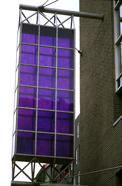
In the masterplan for Java-eiland the architecture facesoutwards, to the waterfront. The traffic is led along boulevards lining the quays. But this does not hold for bicycles.These follow an axis from east to west,towards the bridge and beyond, to the station. To mark this unobtrusive route threading among the blocks of houses and over the,canals, the painter Piet Dieleman has opted for a solution as simple as it is surprising. Simple, because the work consists of two parts that together form a whole with which he illustrates the idea of direction and movement. Surprising,in that he links this bipartition with a painterly reading of colour theory that one would not expect in the open air.Piet Dieleman has designed two facade objects, one yellow, and the other violet. Violet is complementary to yellow,it is formed by mixing the two other primary colours,red and blue. The consequence of this is that when yellow and violet are combined as light, white results. Combinedas a pigment, the result is equally colourless: black. Thus, colour disappears when yellow and violet are brought together. They are set diametrically opposite each other inthe colour circle, which is why Piet Dieleman has kept them far apart, only just visible to the passing cyclist. That idea of bipolarity further expressed by keeping the yellow diffuse and the violet transparent. That choice is inverse proportion to the characters of these colours. Yellow in no way suggests matter but rather unboundedlight, whereas violet seems to be held free of the background as an object rather than exhibiting luminosity. The colours are applied on the inner side of a series of glass trays held in an iron frame at right angles to the frontage.The effect is of two signs advertising companies domiciled here in the street. But the absence of lettering makes it clear that painting is itself being advertised here, even though it is outside its customary habitat of spotless museum walls.
Art in Amsterdam’sEasternDocks Aera
010 publishers Rotterdam 2001
isbn90-6450-438-5
Beschilderd glas
Er ging een lang en zorgvuldig proces vooraf aan de plaatsing van dit kunstwerk, maar uiteindelijk werden de twee verticale objecten aan twee ver uit elkaar gelegen hoekpanden langs het fietspad in de openbare binnentuin bevestigd. Voor een gehaaste voorbijganger zullen de kunstwerken wellicht opgaan in de zeer gevarieerde architectuur, maar op het tweede gezicht lijken zij heel subtiel van de architectuur los te maken. In beide gevallen gaat het om een roestvrijstalen frame, omhuld door glas, dat aan de binnenzijde is beschilderd met een transparante verf. Toch verschillen de twee objecten zo veel van elkaar dat de kunstenaar van een polaire situatie spreekt. Afgezien van de overduidelijke verscheidenheid in het door de frames ontstane raster, de afmetingen en de kleur- de een geel, de ander violet – , bewerkstelligde hij ook een subtiel verschil in de werking van het daglicht. Bij het beschilderen van het glas verwerkte hij in de gele verf een diffuus pigment en bij het violetgekleurde object juist een transparante pigment. Hierin herkent men de ervaring van de schilder Dieleman. Hoewel de objecten doen denken aan papieren lampionnen of vliegers streeft hij er, net als bij zijn schilderijen, naar om met elementen als kleur, vorm, structuur en licht inhoud te geven aan een kunstwerk zonder verhalend onderwerp.
tekst Mirjam Beerman